Songlines are traditional maps created by the Aboriginal tribes of Australia. These maps often appear more like beautiful elaborate paintings, but upon investigation, one discovers that the bright colors, circles, lines, and other various patterns are uniquely representative of a particular person, tribe, or place. Aboriginals believed that everything in nature existed in terms of the human existence developing around it, and that every human and tribe has their own song with similar elements that creates the world as they know it. These maps, though not particularly useful to the common man in this day in age, will forever be a beautiful cultural relic and a representation of truly original art, thinking, and map making of the Aboriginal culture.
Lauralee'sWonderfulWorldofMaps
Monday, April 25, 2011
Parallel Coordinate Graph
Parallel Coordinate Graph
Each variable in a parallel coordinate graph is applied to a vertical axis and data elements are plotted as connected sets of points, with one on each axis. In this 3D parallel coordinate view below, spatial and gene expression information are clearly separated while the basic character of spatial gene expression patterns is displayed in one dimension.
DLG Map
DLG
DLG maps are vector representations of planimetric and topographic map features. These features may be derived from cartographic source materials or from aerial photographs. DLG maps use manual and automated digitizing methods and on doing so, contain a wide variety of information from vegetation cover, to administrative boundaries, to roads, basic topography, and more. The DLG file below shows the transportation available for sale and the transportation in progress in the state of Illinois.
DLG maps are vector representations of planimetric and topographic map features. These features may be derived from cartographic source materials or from aerial photographs. DLG maps use manual and automated digitizing methods and on doing so, contain a wide variety of information from vegetation cover, to administrative boundaries, to roads, basic topography, and more. The DLG file below shows the transportation available for sale and the transportation in progress in the state of Illinois.
http://pubs.usgs.gov/of/2003/of03-471/domier/index.html
DEM Map
DEM
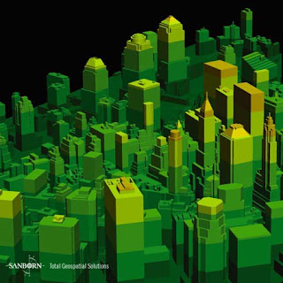
 DEM maps, or Digital Elevation Models, are raster format maps that are produced by recording cartographic data, storing it, and processing the information into a cell of pixel. In this manner, digital files containing information about terrain elevations for ground positions at regularly spaced intervals are produced in a three dimensional format. The example map below shows a DEM of NYC, NY on November 12, 2003.
Bilateral Graph Map
Bilateral Graph
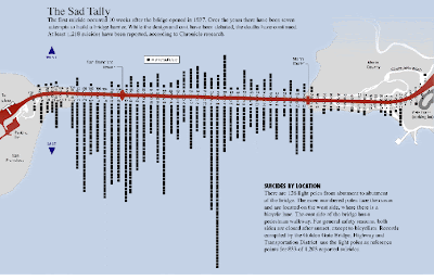
 A bilateral graph is effective in displaying two related variables and how they differ in function. Bilateral graphs are visualization maps that show both increase and decrease on either side of the same map. The map below shows the statistics and results of Golden Gate Bridge jumpers. this graph shows the number of people that committed suicide by their location on the bridge, the east and west sides of the bridge coordinate to positive and negative sides of the graph. By viewing the graph, it can be observed that more jumps occur on the east side of the bridge
 Lorenz Curve Map
Lorenz Curve Map
Lorenz curve maps are useful in representing the degree of inequality that exists between distributions involving two variables. Often times, these curves represent the outcomes of incomes and wealth when they are distributed unequally throughout societies. The dashed lines in lorenz curves display how data would be if properties were evenly distributed and the solid dark line shows the actual distribution. As show in the example below, the area between the curve and the straight line represents the area of inequality.
Range Graded Proportional Circle Map
Range Graded Proportional Circle Map
Useful in representing discrete phenomena with abrupt variations. The data used in this format is usually representative of magnitudes. In the example map below, various sizes of circles and their nominal equivalents are overlaid on a map to represent varying magnitudes of American Indian Populations in different states in 1990. The placement of the circles over the map not only show where these populations reside, but they also easily visually convey the magnitude of each individual population community in doing so.
Subscribe to:
Comments (Atom)

